Inspiring for Togetherness and Acceptance
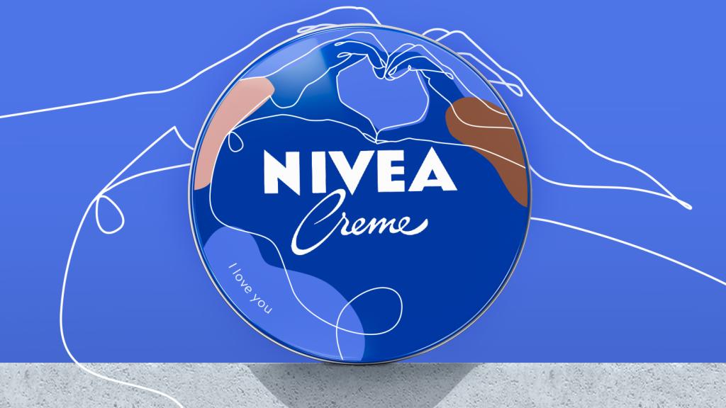
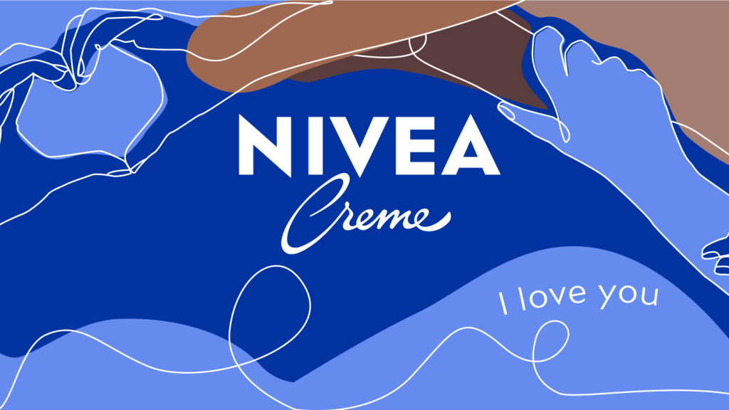
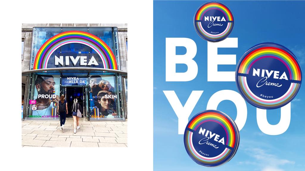
People all over the world are used to seeing Nivea creme in a blue tin. With colorful special editions, we spotlight mainly the inclusive spirit of the iconic brand.
Read more
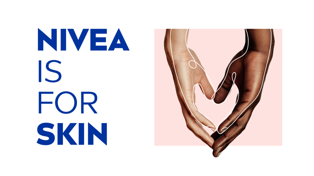
Nivea wants everyone to feel good in their own skin – and believes more togetherness will help ensure a better future for everyone. This idea we express visually using flowing illustrations of people touching, of caresses of different kinds. The images can be understood throughout the world, and they transport a personal message intended to bring people closer together.
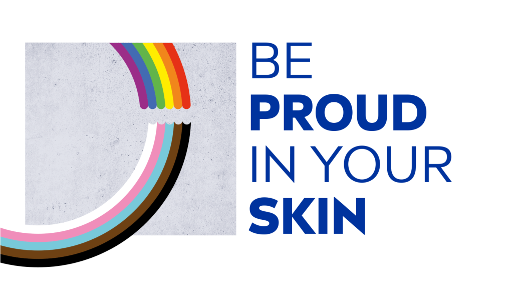
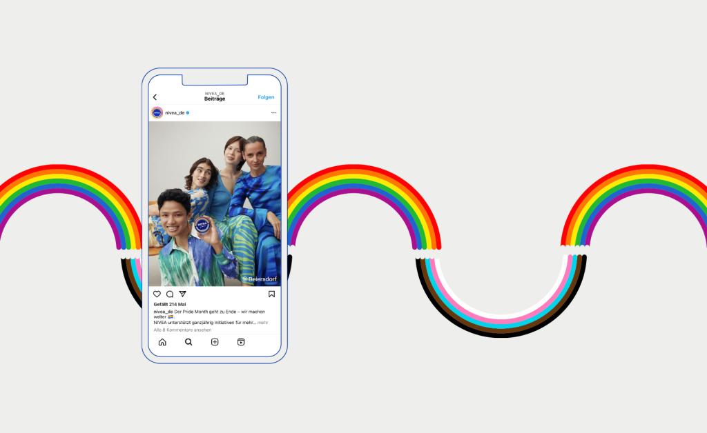
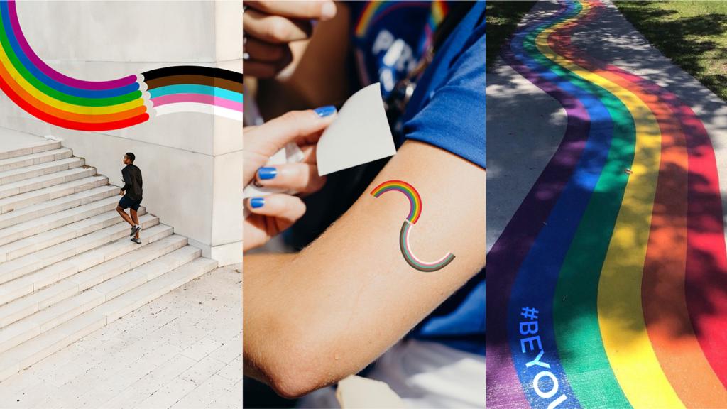
We also bring one of the most important messages of our time into every bathroom: more acceptance. The special edition tins feature the eleven colors of the Pride Progress flag in the form of two rainbows. Suitable for packaging of any size and in any medium, our design ensures all the colors are equally represented at every touchpoint and can be combined in numerous ways.

Heidrun
Executive Creative Director

Lukas
CEO Managing Partner
Next up
Triathlon Bundesliga
Giving triathlon four colors and new coolness

