Making an 80s icon lifestyle-ready
Sports nutrition is no longer just about performance in sport, but also about lifestyle. We ensure that Powerbar can tap into new target groups with a more open design.
Read more
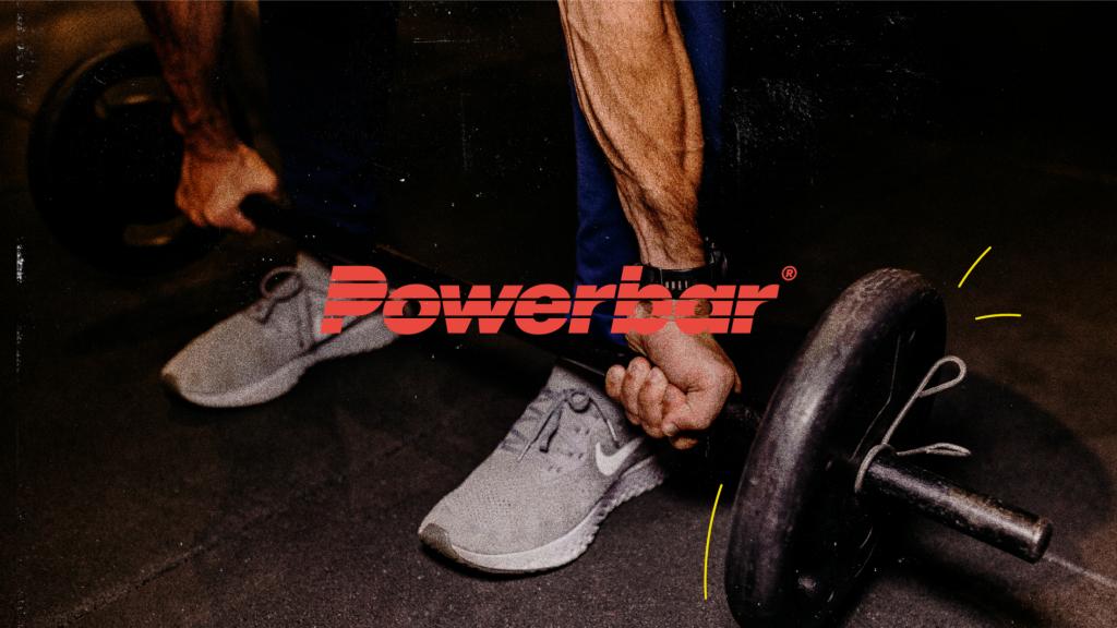
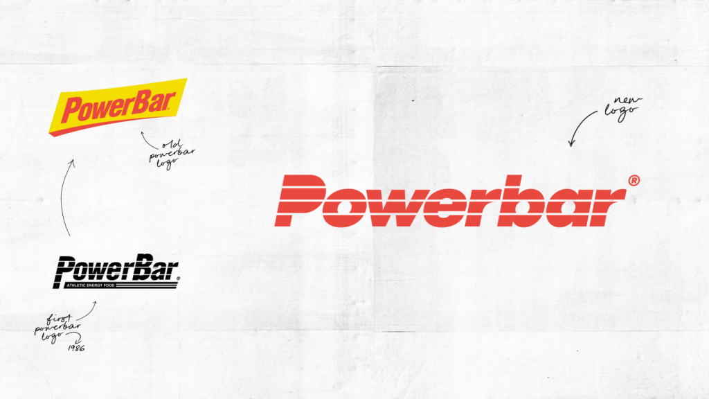
Professional athletes and Powerbar go together like biceps and triceps. A perfect match. After all, Powerbar created the sports nutrition segment. But what was once a niche product is now an entire lifestyle industry. Which is precisely the reason Powerbar needed to evolve, too. With a new design and a strengthened brand core, we made Powerbar fit for the future.
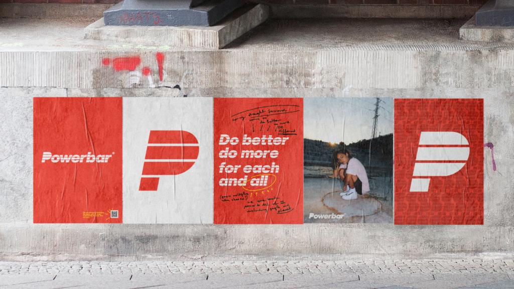
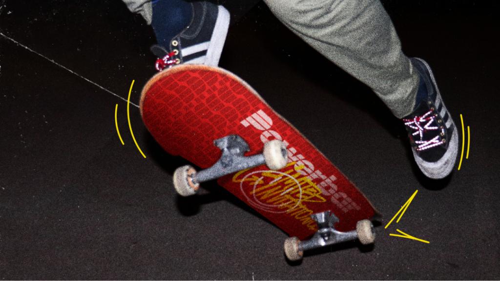
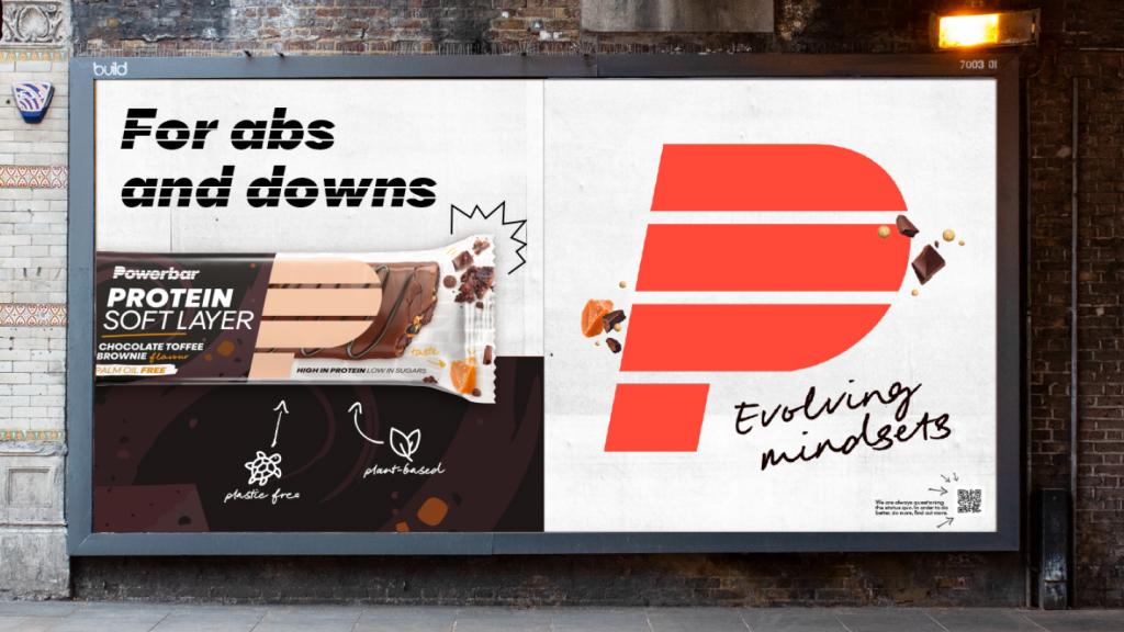
We are taking the iconic look of the 1980s and giving it a new, contemporary twist: less drill, more fun, sustainability and inspiration! New colors enable the brand to address different target groups – whereby the familiar red-yellow combination is still used for the core segment of high-performance athletes.
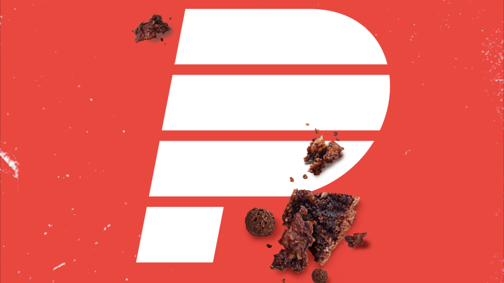
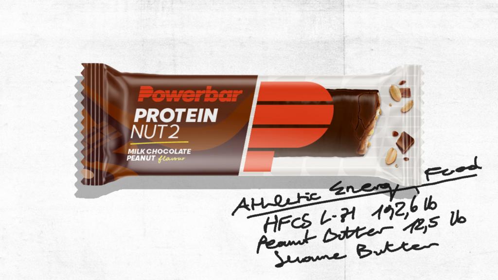
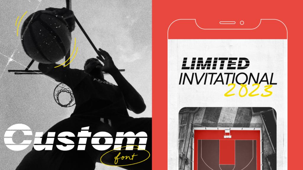
And with many other new elements, we are making the corporate design system as comprehensive as it is flexible: The initial P as a meta-symbol opens up new communicative scope for Powerbar. Hand-drawn icons make product benefits understandable and the brand more approachable at the same time. And the custom corporate font picks up on the character of the logo: It is perfect for communicative headlines in which Powerbar is immediately recognized as the sender.

Sven
Executive Creative Director
Verena
Senior Designer
Next up
Hilti
Changing an icon without changing the icon


