How design makes health a matter of the heart
Health is the most personal thing in the world. But health insurances often feels bureaucratic. Well, they really do not have to: For BARMER, we prove there is a better way! With a design that is more emotional, more digital, always accessible. And that sets new benchmarks along the way.
Read more
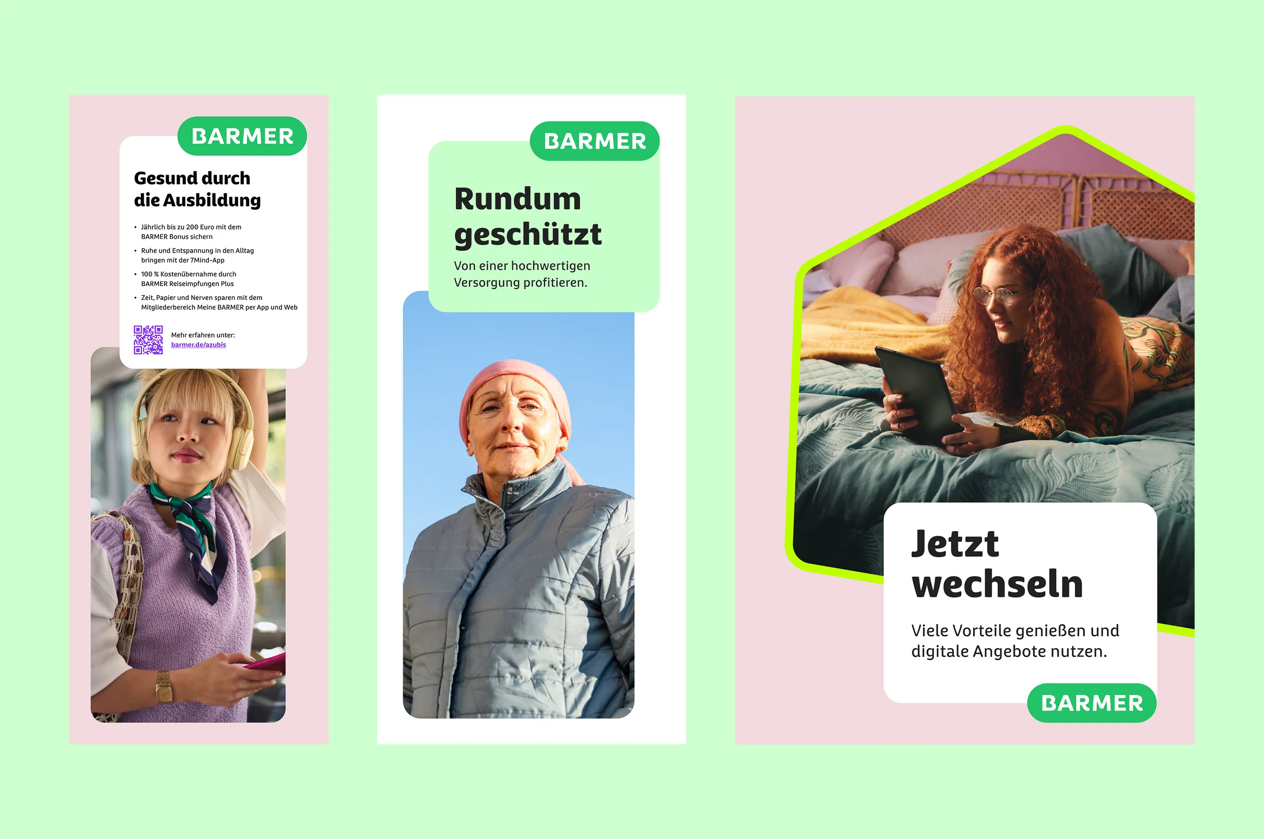
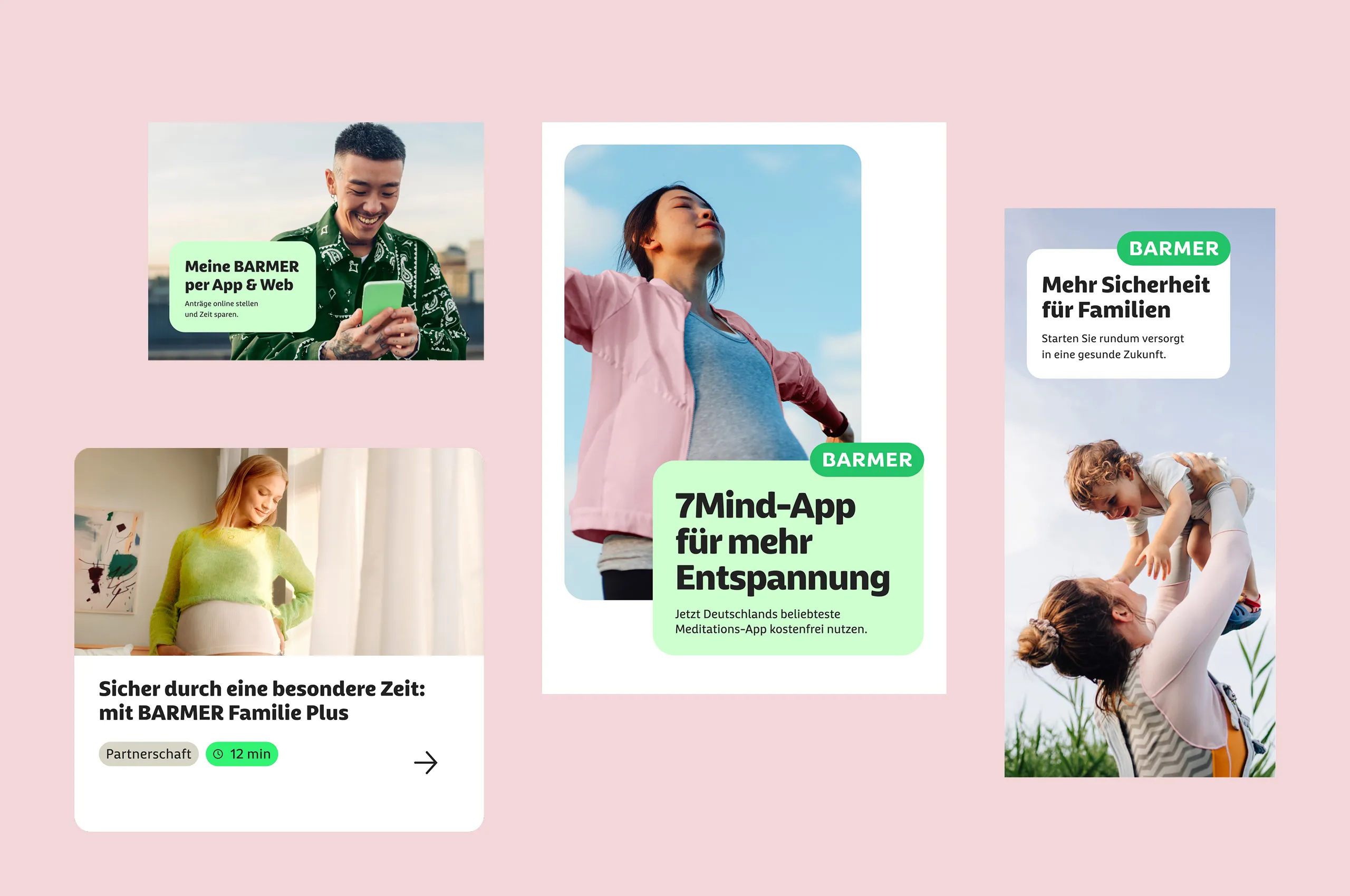
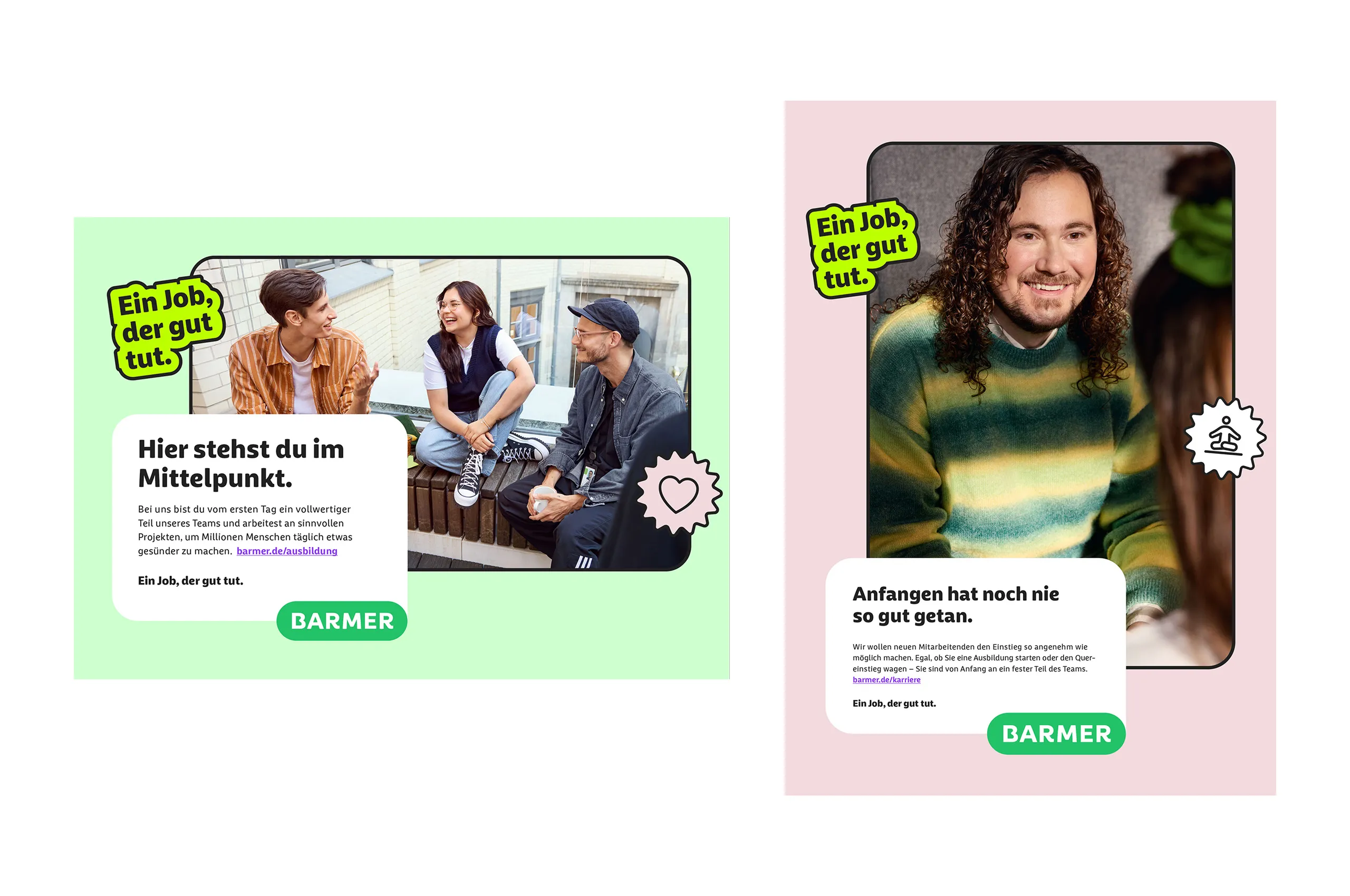
BARMER wants to stand by its members with empathy. Appreciative and straightforward in the case of a claim. But also enabling, motivating and equipped with smart preventive solutions. Digital services play a big role here but must not create distance.
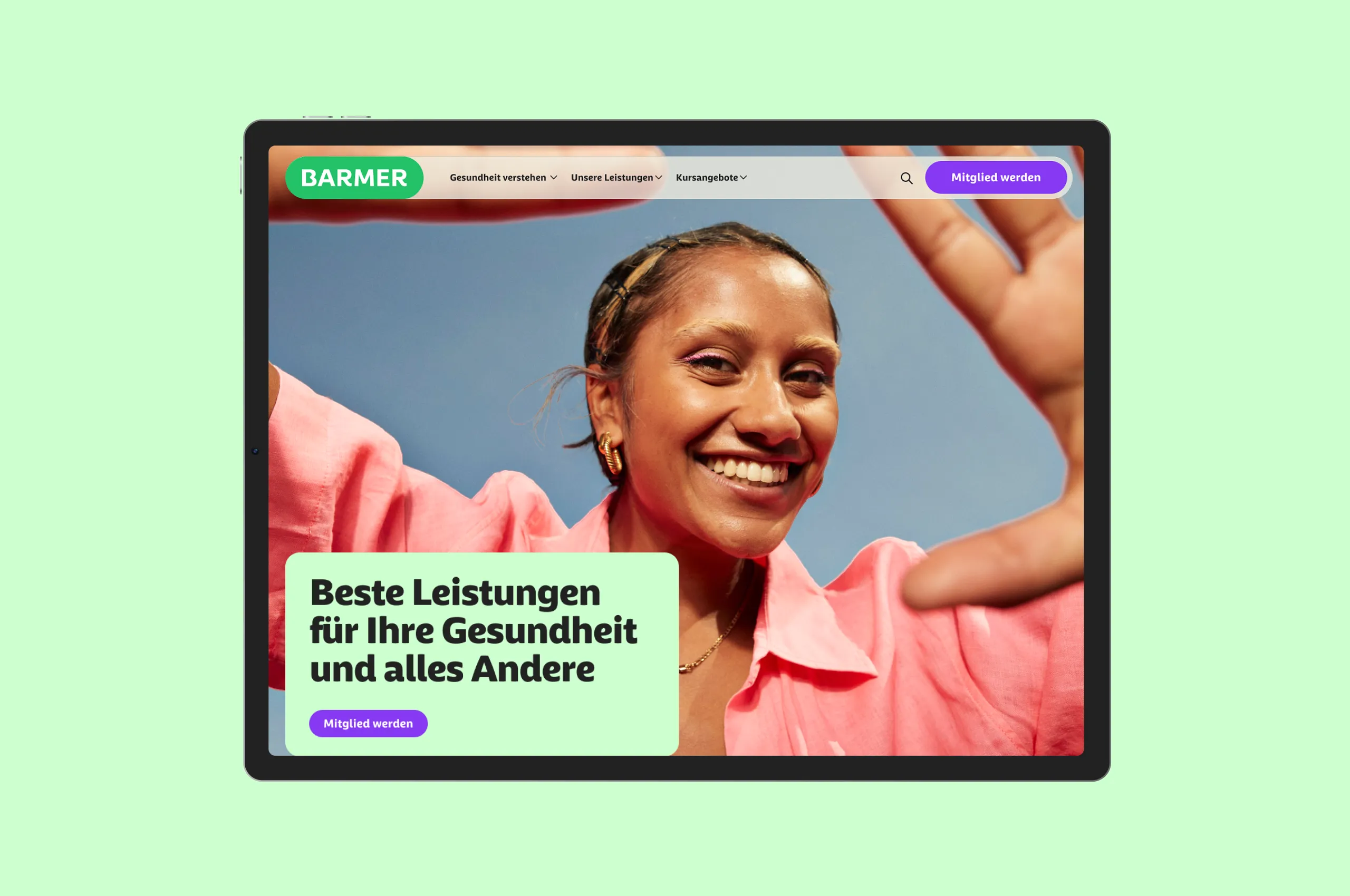
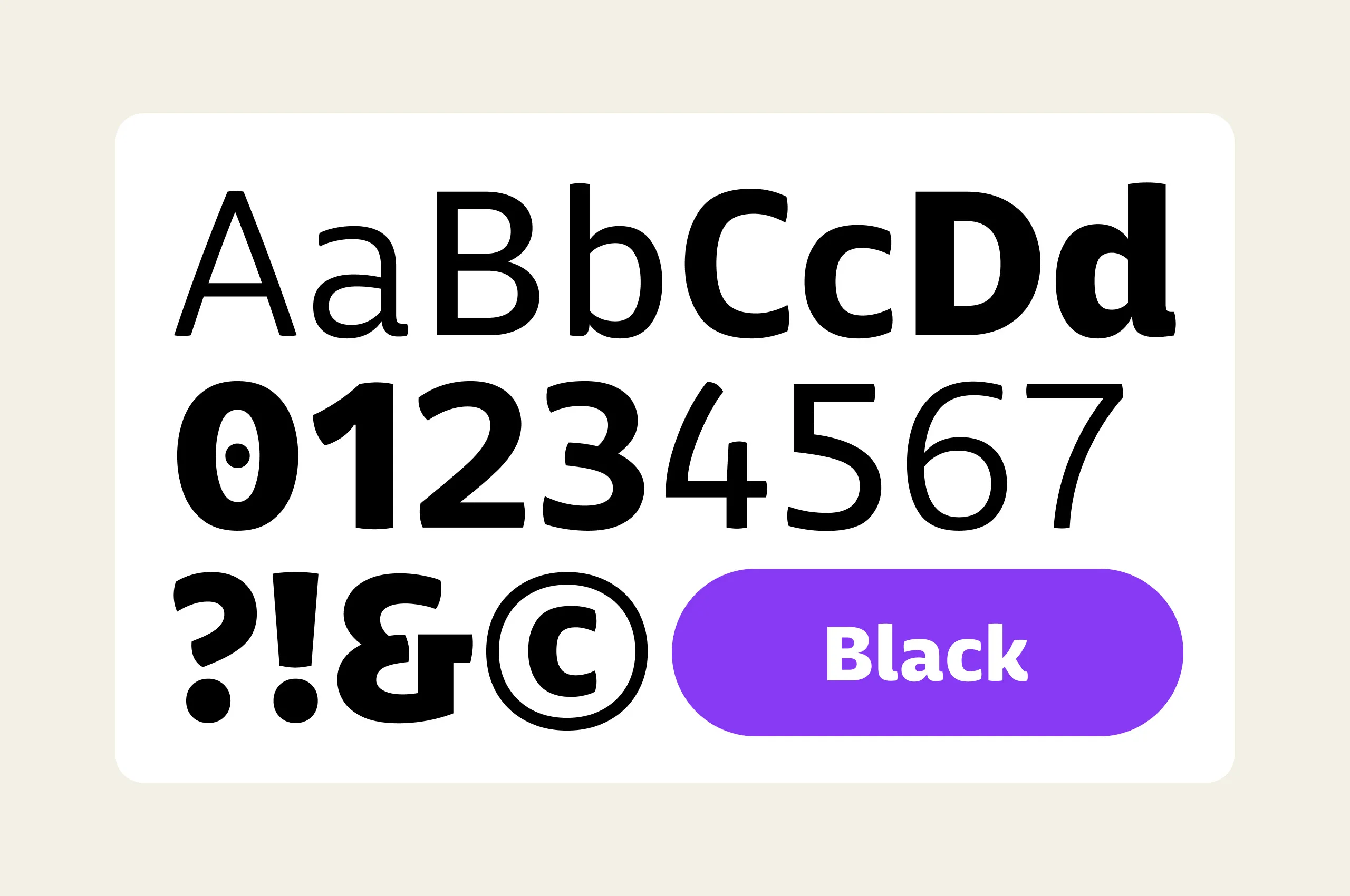
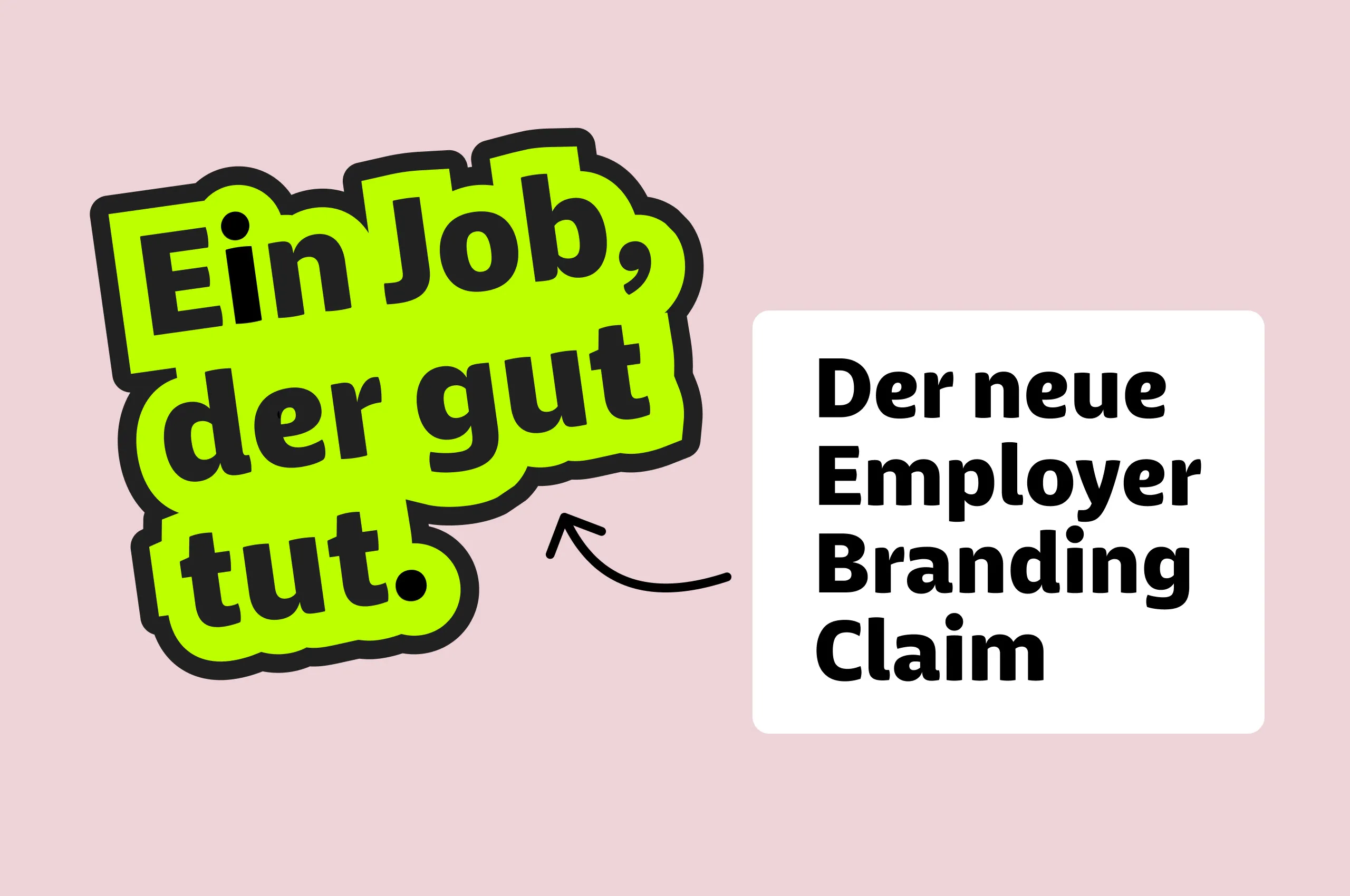
On this basis, we develop a radically new design system for BARMER. Human, empowering, progressive. Every single element reflects this. The logo and the bespoke typeface we created feel instantly approachable thanks to their soft curves. The color palette and imagery are friendly, natural and confident.
From day one, digital services sit at the heart of the design. You notice this at first sight in the bright green that is optimized for screens yet still typically BARMER. But you can also experience it in the clear user journeys and in the uncompromising standards of accessibility. So every member can quickly find what they need. Including powerful tools for a healthy life.

Dominik
Design Director
Christine
Director Consulting
Next up
Hilti
Changing an icon without changing the icon