April 2026
Peter Schmidt Group creates new brand identity for the cult shower gel Cliff
The shower gel brand Cliff is an icon of the 1980s and 1990s – now it is returning to store shelves with a new look: bold, modern, and unmistakably Cliff. Branding and packaging design were developed by the Peter Schmidt Group.
The shower gel brand Cliff is experiencing a comeback. To ensure its success, the brand and design agency Peter Schmidt Group has placed Cliff’s self-image into a contemporary context and developed an identity that is both modern and full of character. It defines the new packaging, with which Cliff has been returning to supermarket and drugstore shelves across Germany since this week.
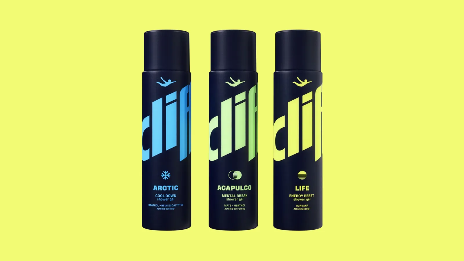
The designers carefully modernized the core elements – the wordmark and the iconic cliff diver. The color palette is defined by a deep, dark blue and vibrant accent colors. The result is a highly dynamic look, accompanied by a new visual style. Taken together, these elements resolutely bring the brand into the present.
“Cliff and the cliff divers of Acapulco were style-defining for the 1980s and 1990s,” explains Inga Wolter, Executive Creative Director and Head of Consumer Branding at the Peter Schmidt Group. “But society and our understanding of masculinity have changed. With Cliff, we are consistently moving from self staging to self reflection, from adrenaline to regeneration. This gives the brand new relevance.”
New Concepts of freshness and masculinity
In the 1980s, Cliff set new standards in the market and stood for coolness in a double sense: in 1988, it used eucalyptus as an active ingredient and introduced a completely new level of freshness to showering. At the same time, its advertising campaigns presented the Clavadista cliff divers of Acapulco as symbols of performance-oriented masculinity. Both struck a chord with the times and made Cliff the best-selling shower gel in Germany.
However, around the turn of the millennium, the brand began disappearing from stores more and more frequently. The reason: its image no longer matched changing ideas of the shower experience and masculinity.
“We have strengthened the aspects of care and well-being and are turning the shower gel into a tool for a functional reset of body and mind,” says Inga Wolter. It was particularly important to the designers to further develop the brand holistically—beyond packaging alone. As a result, Cliff is not only intended to appeal to people who still associate the products with memories of their youth; the brand’s identity, purpose, and campaign are also specifically aimed at younger generations who are discovering Cliff for the first time.
The design and strategy were developed by a team consisting of Yara Soliman (Design Director), Alexander Schad (Brand Strategist), and Magdalena Hicks (Director Consulting). At market launch, Cliff is available in three variants with different functional benefits: “Acapulco” for mental freshness, “Arctic” for noticeable recovery, and “Life” for an extra boost of energy. The concept and strategy for the subsequent brand campaign were developed jointly by BBDO Germany and BurnusCare GmbH.