Future-proofing a leader in IT with design.
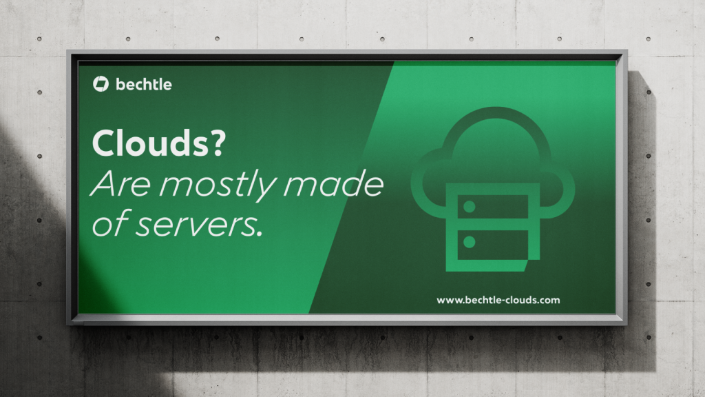
Bechtle is Germany’s largest IT systems house. After 40 years, the company decided to refresh its brand identity. We used the power of design to help Bechtle convey a confident ambition: taking a leading role in the European market.
Read more
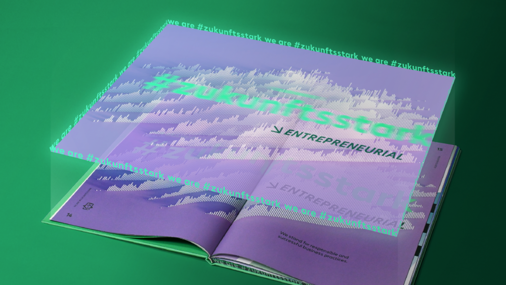
We set out on a search in a series of workshops: What exactly makes Bechtle unique? The answer: Employees bring together seemingly opposing qualities to create an offering that is “zukunfsstark” (roughly: future-first). Expertise and empathy, experience and curiosity, a wide range of possibilities and a focus on what truly matters.
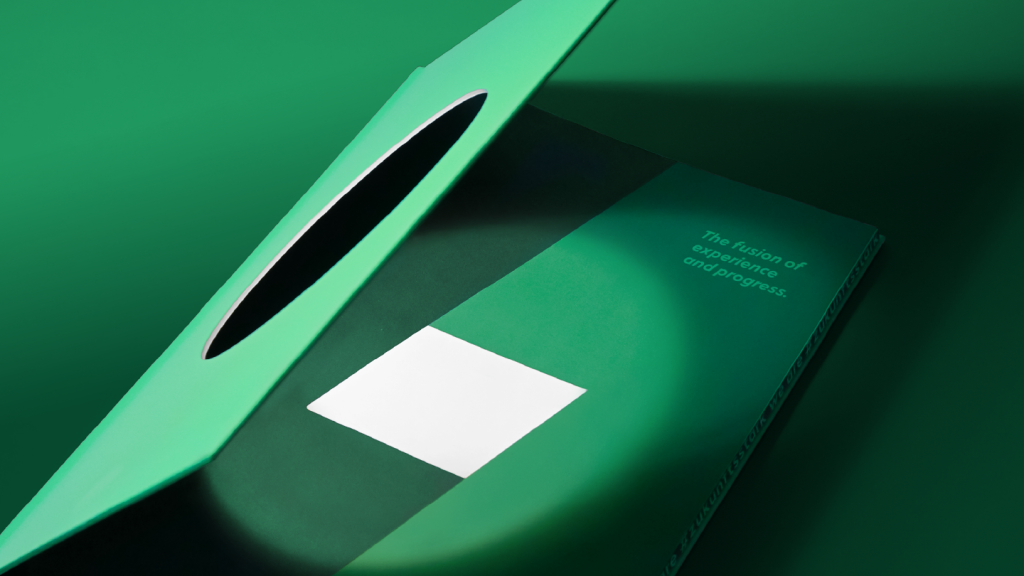
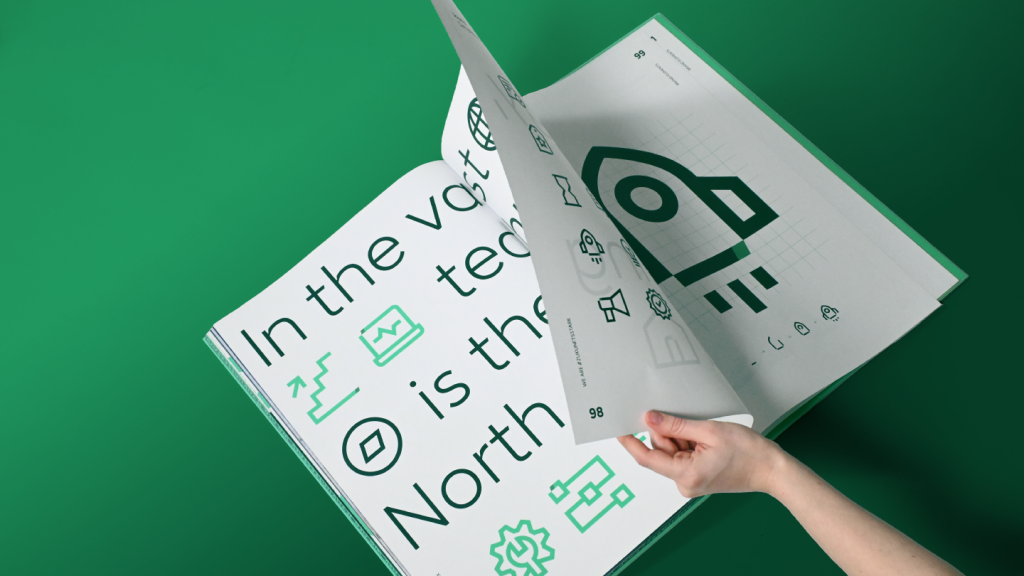
As a result, we reimagined the previous logo – a parallelogram tilted at a 19-degree angle. It now becomes a shape formed by the overlap of two circular segments. Opposites that come together to create a simple symbol. This new form allows for themes to be emotionally visualized – especially in animated applications. The parallelogram shapes the entire design system, appearing in the wordmark, layout structure, icons, illustrations and even the new corporate typeface. The colour concept meets the highest accessibility standards, making “zukunftsstark” a value accessible to all.

Ulrich
Creative Director
Jannika
Designer
Next up
Hilti
Changing an icon without changing the icon


