A rebrand that sticks
We take tesa’s consumer portfolio to the next level: by creating a clearcut, modern design system, strengthening brand presence and ensuring effortless product recognition.
Read more
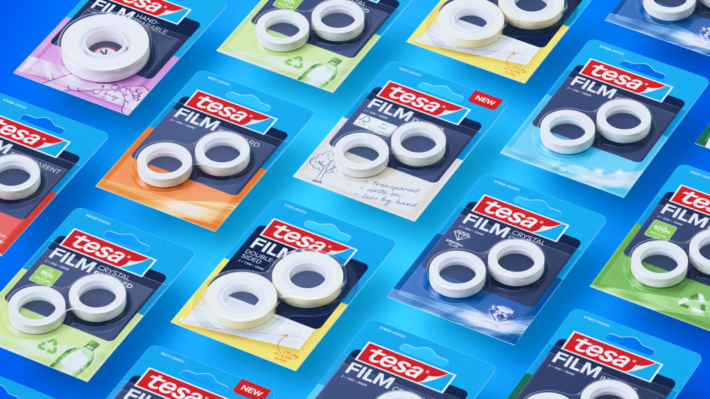
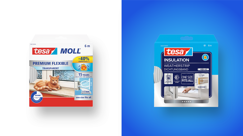
On the market since 1935, tesa is so well-known that its name even appears in the dictionary. However, it’s not just the name people recognize – it’s the iconic logo and the distinctive color combination. The goal: preserve recognition, modernize the brand, and provide clear orientation at the point of sale.
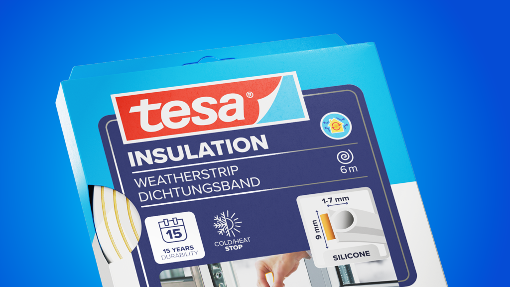
With over 30 sub-categories and 1,700 SKUs previously developed in silos, the challenge was clear: bring coherence in the portfolio of the consumer products without losing the individuality of each line. Grounded in profound insights from customer journeys, POS analysis, and shopper data, we developed a unified design language that reflects tesa’s renewed positioning. With a bolder logo, clearer visuals, and consistent naming, the new packaging creates stronger shelf impact and ensures the brand remains in shoppers’ minds.
The result? Not just a fresh look, but a design system that binds the entire consumer portfolio together — setting a strong foundation for tesa‘s future. In short, a rebrand that truly sticks.


Yara
Design Director

Hanna
Head of Consulting
Next up
Hilti
Changing an icon without changing the icon


