Reimagining a century of natural care
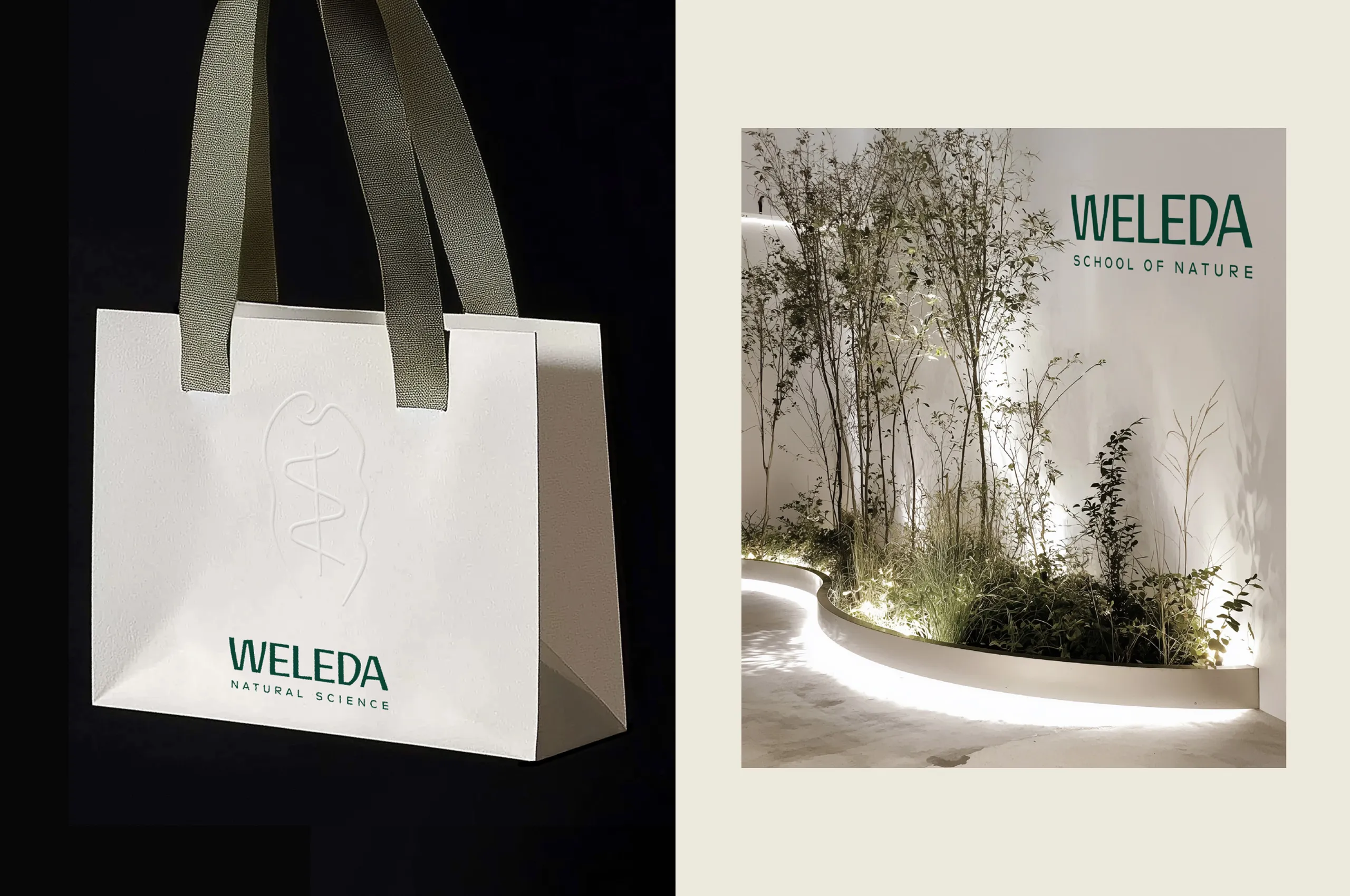
We have created a corporate identity that preserves Weleda's core philosophy and translates it into a contemporary narrative. The new subline “Natural Science” highlights what has distinguished Weleda for over 100 years – its commitment to sound natural knowledge and research.
Read more
Weleda — a sustainable native, an icon, a pioneer in natural health for over 100 years — is getting a contemporary rebrand. Weleda stands for sustainable, scientifically based natural cosmetics and medicines, developed from anthroposophical thinking.
The challenge was to bring the beloved but outdated typeface into a modern form without denying the brand's history. The goal was to create clear access for a new, open-minded generation – in a visually overloaded world where ‘real’ often has a quiet impact. The design was intended to make it clear once again why Weleda is a premium product: through its combination of emotional depth and precise effectiveness. The new design translates the brand's values into a form that honours its founding spirit while looking openly to the future.
This rebranding brings a brand that is over 100 years old into the present day with respect and sensitivity. The balance between emotional heritage and design clarity is uniquely successful. It is innovative because it does not have to be loud to make a statement. And because it shows that even iconic things can be changed – if you understand them.

Tobias
Senior Designer

Markus
Senior Director Consulting

Next up
E.ON
From kick-off to relaunch in three months